WATSON WEBSITE CASE STUDY
The task
I was tasked with leading the UX/UI design effort for the e-commerce workflow of a mobile-first website introducing WATSON, a high-end digital and film camera brand. The goal was to craft a seamless, premium shopping experience tailored to young adults in the United States, ensuring the brand’s innovative positioning was reflected through both usability and design aesthetics.
CHALLENGES
Designing a mobile-first e-commerce experience for a new brand like WATSON presents a unique set of challenges. As a new entrant in the U.S. market, the brand must establish trust quickly while communicating a premium identity that resonates with young adults who are both digitally savvy and highly selective. The challenge lies in balancing clarity with aspiration: the interface must feel intuitive and frictionless, yet differentiated enough to reflect the brand’s disruptive positioning. With limited brand recognition, every interaction—from navigation to checkout—carries the weight of introducing not just a product, but an entire ethos. In this context, design is not simply about usability, but about crafting credibility, emotional connection, and a narrative that makes WATSON feel both desirable and dependable from the very first tap.
GOALS
The primary goal of this project was to design a mobile-first e-commerce experience that positions WATSON as a premium yet accessible camera brand for a new generation of U.S. consumers. The website needed to communicate the brand’s values of innovation, quality, and sustainability while making the purchase journey seamless and intuitive. Beyond driving conversions, the experience aimed to build trust, foster brand recognition, and create an emotional connection with a new audience. Every design decision, from product storytelling to checkout flow, was guided by the objective of balancing usability with a distinctive, aspirational identity that could establish WATSON as a credible disruptor in a highly competitive market.
Solution
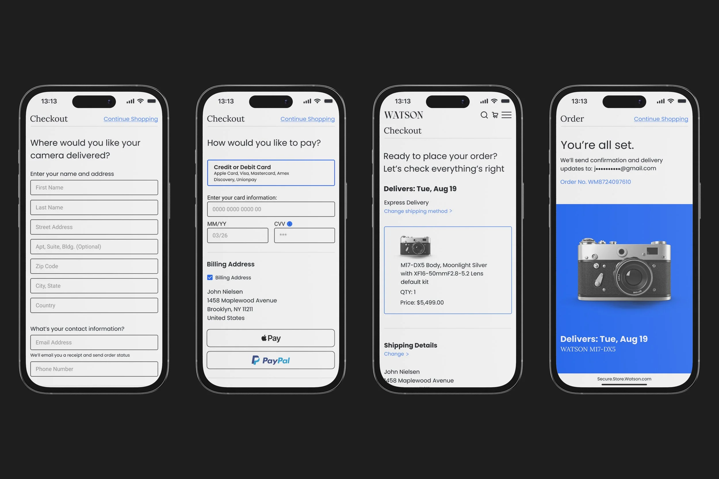
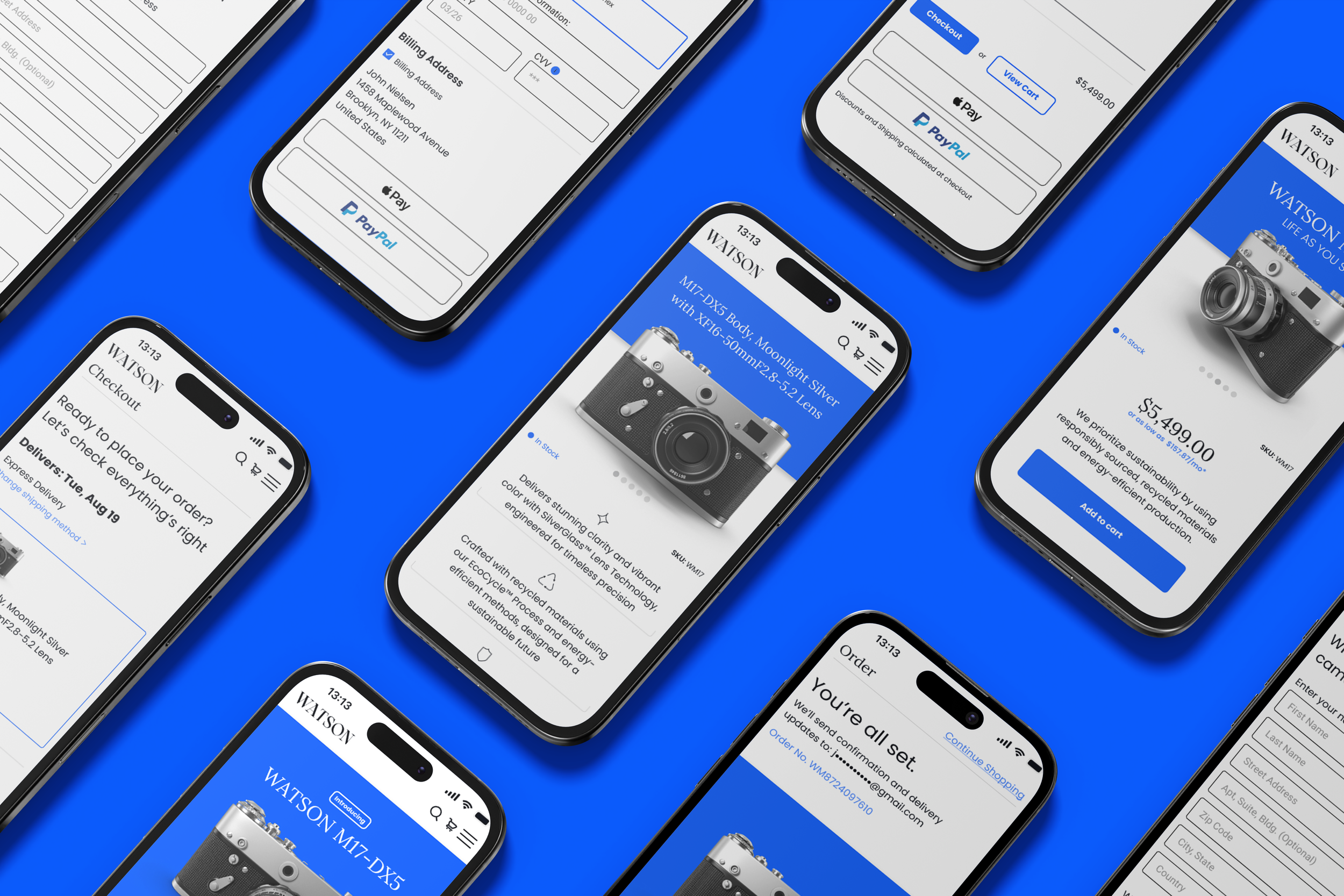
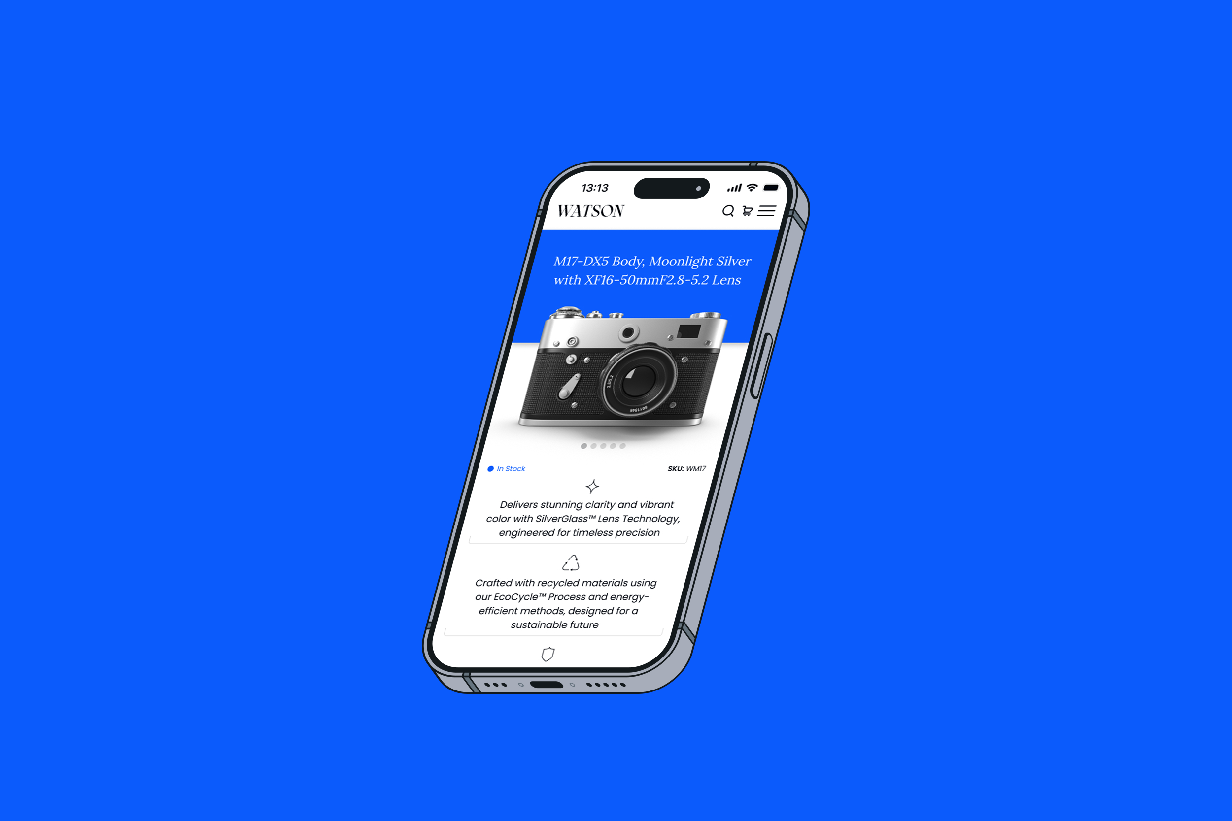
Our solution focused on crafting a bespoke, minimal visual identity that set WATSON apart from legacy camera brands and retailers, many of which rely on dated and uninspiring design. By streamlining the user journey around the customer, we applied a clear design hierarchy that reduced friction and guided shoppers naturally from discovery to purchase. The mobile-first approach ensured the website was fully optimized for today’s consumers, delivering fast load times, intuitive navigation, and a seamless checkout experience. Just as importantly, we prioritized accessibility by following WCAG standards, adding alt text to images, using high-contrast colors for readability, and enabling full keyboard navigation. Together, these decisions created a shopping environment that felt premium, inclusive, and effortless, reinforcing WATSON’s positioning as a modern, disruptive brand.
APPROACH
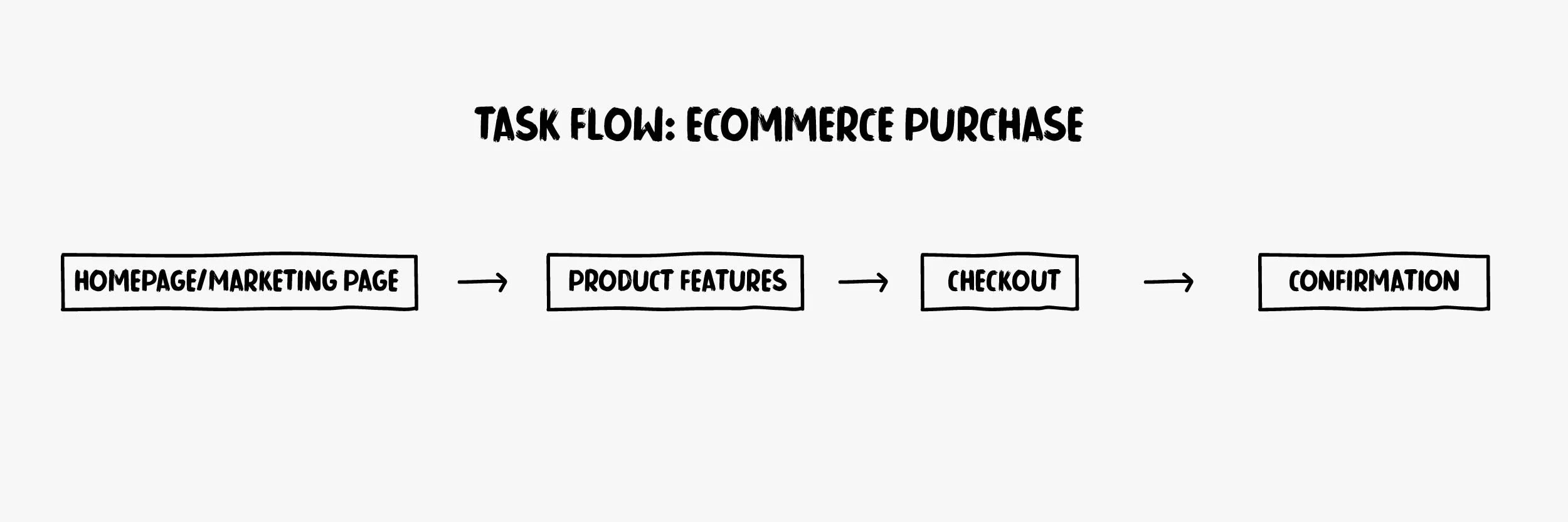
Our approach began with the development of low-fidelity wireframe prototypes to map and test different workflow scenarios. This method allowed us to quickly validate ideas, gather feedback, and identify points of friction in the customer journey without investing heavily in visual design too early. By focusing on structure and usability first, we were able to compare multiple paths, refine navigation, and ensure the flow from product discovery to checkout felt seamless. This iterative testing process gave us the clarity to select the most intuitive and efficient workflow, laying a strong foundation for the final design.

RESULTS
User testing with WATSON’s target audience showed strong results, with participants responding positively to the streamlined e-commerce workflow and minimal visual identity. The mobile-first design was praised for its speed, intuitive navigation, and seamless checkout, while accessibility features reinforced a sense of inclusivity and trust. Overall, testing confirmed that the experience not only met usability expectations but also positioned WATSON as a premium, modern alternative to traditional camera brands.